ShopDreamUp AI ArtDreamUp
Deviation Actions


Suggested Deviants


Suggested Collections


![[C] Scarlett](https://images-wixmp-ed30a86b8c4ca887773594c2.wixmp.com/f/1dd7a1f5-5227-407c-8371-79ed6f1fdbf0/dalfl0u-5d68af90-bb95-4eed-9ea9-15b53a5f8c21.png/v1/crop/w_184,h_184,x_0,y_12,scl_0.23/_c__scarlett_by_zukich_dalfl0u-92s-2x.png?token=eyJ0eXAiOiJKV1QiLCJhbGciOiJIUzI1NiJ9.eyJzdWIiOiJ1cm46YXBwOjdlMGQxODg5ODIyNjQzNzNhNWYwZDQxNWVhMGQyNmUwIiwiaXNzIjoidXJuOmFwcDo3ZTBkMTg4OTgyMjY0MzczYTVmMGQ0MTVlYTBkMjZlMCIsIm9iaiI6W1t7ImhlaWdodCI6Ijw9MTAxMCIsInBhdGgiOiJcL2ZcLzFkZDdhMWY1LTUyMjctNDA3Yy04MzcxLTc5ZWQ2ZjFmZGJmMFwvZGFsZmwwdS01ZDY4YWY5MC1iYjk1LTRlZWQtOWVhOS0xNWI1M2E1ZjhjMjEucG5nIiwid2lkdGgiOiI8PTgwMCJ9XV0sImF1ZCI6WyJ1cm46c2VydmljZTppbWFnZS5vcGVyYXRpb25zIl19.Fn52pZVWyEh-c-lrfpTPXWR1zAkewoiRaKj6K3MD5TA)
![[C] Scarlett](https://images-wixmp-ed30a86b8c4ca887773594c2.wixmp.com/f/1dd7a1f5-5227-407c-8371-79ed6f1fdbf0/dalfl0u-5d68af90-bb95-4eed-9ea9-15b53a5f8c21.png/v1/crop/w_92,h_92,x_0,y_6,scl_0.115/_c__scarlett_by_zukich_dalfl0u-92s.png?token=eyJ0eXAiOiJKV1QiLCJhbGciOiJIUzI1NiJ9.eyJzdWIiOiJ1cm46YXBwOjdlMGQxODg5ODIyNjQzNzNhNWYwZDQxNWVhMGQyNmUwIiwiaXNzIjoidXJuOmFwcDo3ZTBkMTg4OTgyMjY0MzczYTVmMGQ0MTVlYTBkMjZlMCIsIm9iaiI6W1t7ImhlaWdodCI6Ijw9MTAxMCIsInBhdGgiOiJcL2ZcLzFkZDdhMWY1LTUyMjctNDA3Yy04MzcxLTc5ZWQ2ZjFmZGJmMFwvZGFsZmwwdS01ZDY4YWY5MC1iYjk1LTRlZWQtOWVhOS0xNWI1M2E1ZjhjMjEucG5nIiwid2lkdGgiOiI8PTgwMCJ9XV0sImF1ZCI6WyJ1cm46c2VydmljZTppbWFnZS5vcGVyYXRpb25zIl19.Fn52pZVWyEh-c-lrfpTPXWR1zAkewoiRaKj6K3MD5TA)


You Might Like…


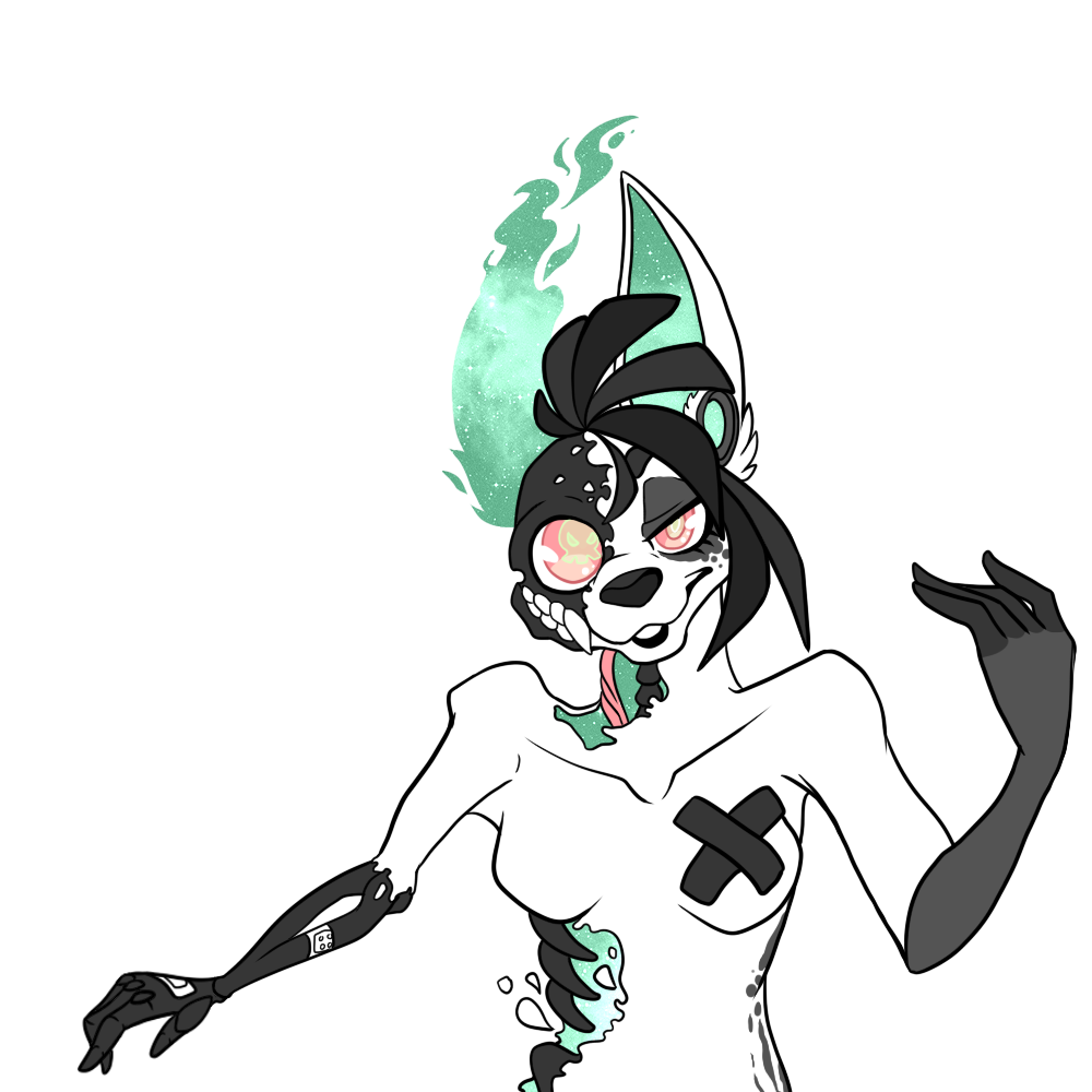
Description
"Welcome to the New Age"
WIPWIPWIPhafta go to work!
But am already kinda proud how it came out,
so wanted to show off lD
And, i'm affraid i mess it up with shading, gonna try something new.
Did you guys already notice that Merah's bones are black?
And that i love to draw dry gore? <3
OH WELL.
tell me what you think!
OH, before i forget,
her left side is supposed to look crooked, like,
the shoulder is dislocated for example~
But i'm not sure how to exaggerate that, any tips?
Image size
1000x1000px 268.01 KB
© 2013 - 2024 Keesness
Comments33
Join the community to add your comment. Already a deviant? Log In
Hi!
Two things I really like about this one: her facial expression, and her colour scheme! The colours are wicked, especially the space-glitter insides and eyes. I know this is a WIP, but the flat shading in contrast with the texture space-stuff looks really cool!
The anatomy is really good (especially the hands!), but some things to note:
- the collarbones seem too low, and out of line with the shoulder bones on both sides. In fact, I think you should be able to see part of her collarbone through the hole in her neck! holidayverve.typepad.com/.a/6a… Her pelvis bone also looks a bit high, I don't think it should be in line with the belly button.
- the right arm (or her left) is much longer than the other and the perspective is a bit off in the angle that she is holding it. Reducing the angle of her inner right arm and foreshortening the upper arm a little would be my advice.
- as for the dislocated shoulder, I'm going to throw a guess that only the shoulder bone should be exaggeratedly out of place, while the rest of the arm hangs down more limply! www.oocities.org/gatorpasports…
Lastly I think it would be cool if the other parts of the picture where she has the space-glitter was line-less like her left ear, especially on her stomach where the space-glitter seems to be spilling out. Just a thought.
Vision and Originality: 2.5 and 3 respectively. Not exactly original but I know you're drawing in a particular fandom.
Technique and Impact: 3.5 and 4 respectively because your line-art is lovely and you definitely have good design sense!
Can't wait to see how this looks if you continue to work on it!